Logo design process for Dosis
The most common phrase I hear when I say I'm a designer is "I want a logo!", which is just a starting phrase that leads to a long conversation about branding. Yes my friend, branding is what you need, a logo can't do all the selling work for you business. Having a coherent and consistent brand with a clear message can become and incredible valuable asset.
But creating a brand is no lame lazy job, it requires a lot of effort, time, a clear idea, a good service/product and lots of back-and-forth... This is why I thought you would be interested on taking a look at what's involved in the design process of a brand.
In this post I want to share the work done for "Dosis – Design Experts", launched in 2012. The client had already registered the name and tagline, so we went straight to developing the creative brief, where we were able to define all the key information about their brand, objectives, goals, as well as key concepts:
“Dosis is a boutique interior design studio, with a 360 kind of service, that goes beyond just decore, covering all the client’s needs. We want to give our clients ‘a dosis’ of style and art to their lives”
The brand had to inspire curiosity and playfulness, but also classic elegance and creativity, so concepts of vintage looks, textures, hand-made elements, and bright colors were important to maintain. The client specifically requested to have a typographic logo and a secondary version to be used as a stamp.
With this in mind, along with all the information gathered in the creative brief, I started with an esencial first step. The moodboard (you can download the complete moodboard here):

I worked with the client to narrow the complete moodboard to essential visual examples that communicated the "look & feel" of the brand we wanted to create. From the moodboard we also extracted a starting color palette:

There are great tools to create color palettes. I tend to use the images of the moodboard to find the colors and for that I either use Photoshop (pixelating the images to the max) or online tools like Color Scheme Designer, Colour Lovers, or Paletton.
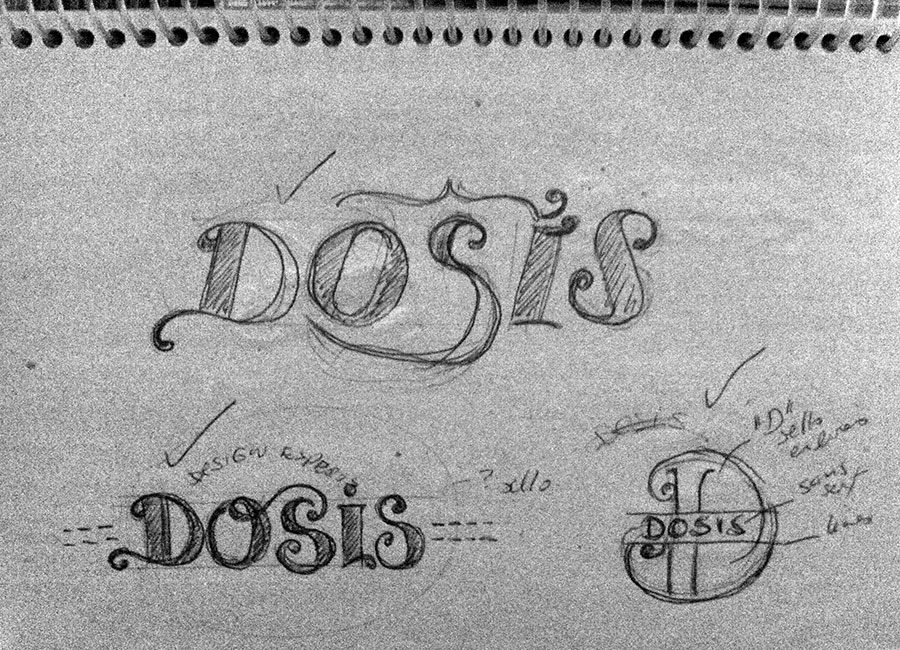
With the moodboard and color palette alternatives set, I started the design process. Always with pen and paper, because my brain just works better that way... here are some examples of that:
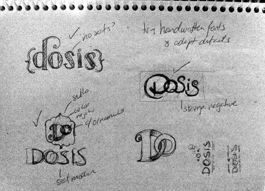

Depending on the client, sometimes I actually involve them early on the design process. Some people are better visualizing "designs in progress", some are not, so I'm cautious about it. In this case, since both partners in the company were designers, I actually showed them some sketches early on in the process.
From here I started to edit the ideas to create clean designs in the computer, giving the client different alternatives. I always start only with black and white designs, so we can focus on the forms first.
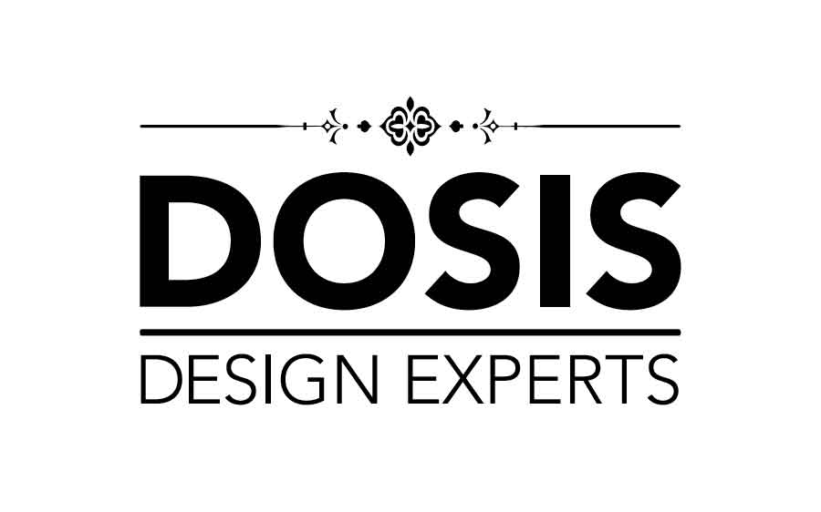
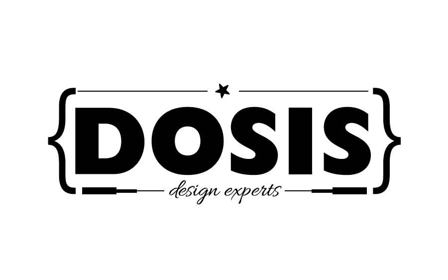
PRESENTATION 1


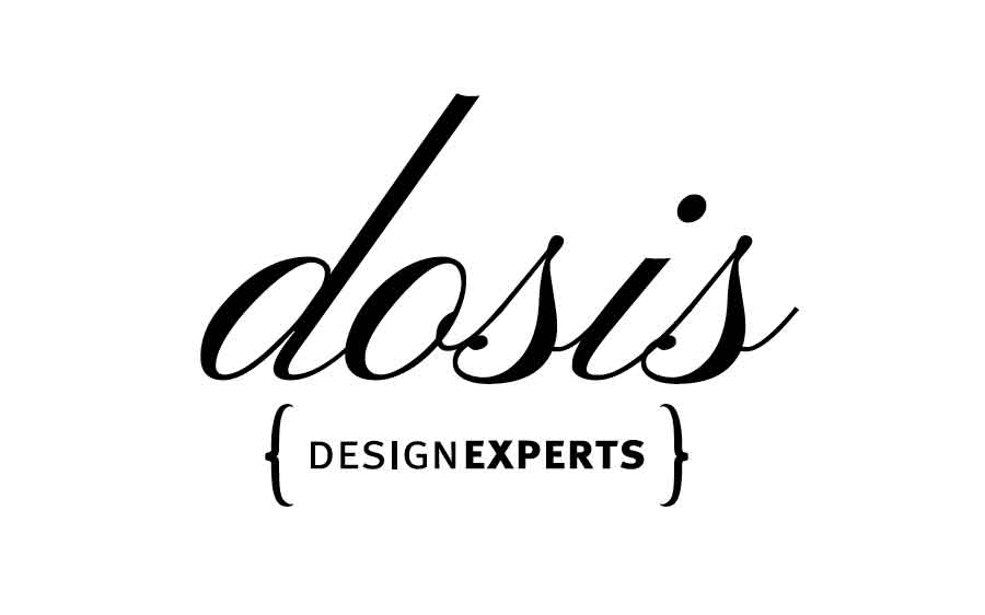
After this presentation, one of the business partners decided she wanted to see some more modern options with a bit less vintage feel, and thicker fonts. So we set up to explore that, while maintaining the key concepts established on the creative brief.
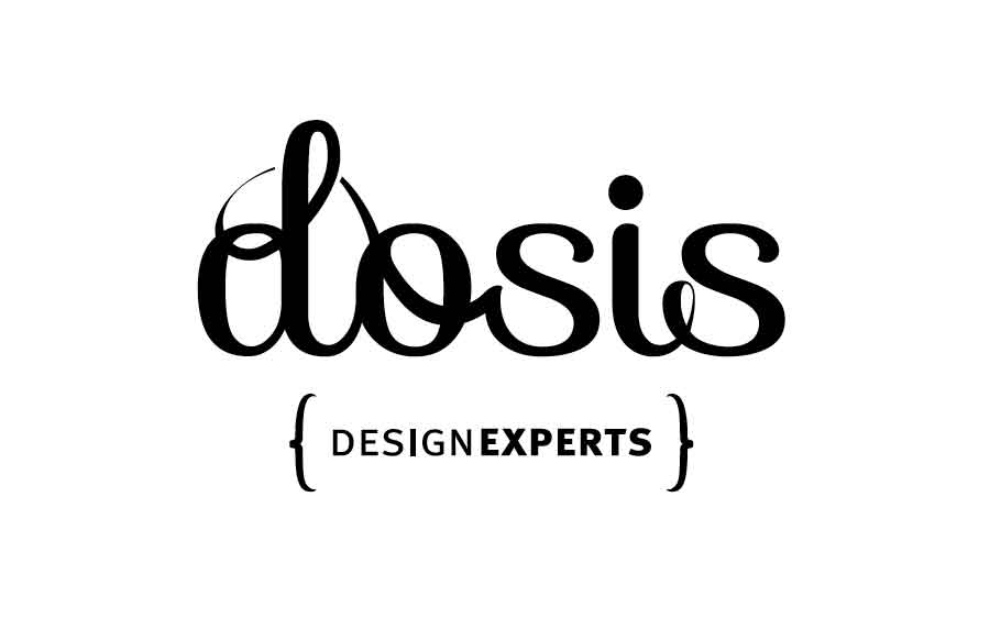
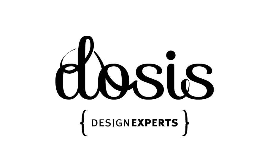
PRESENTATION 2
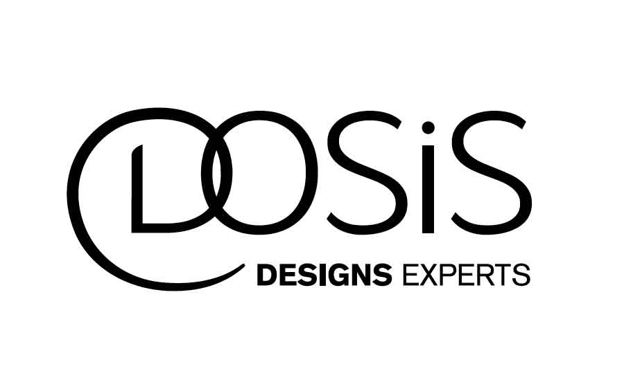
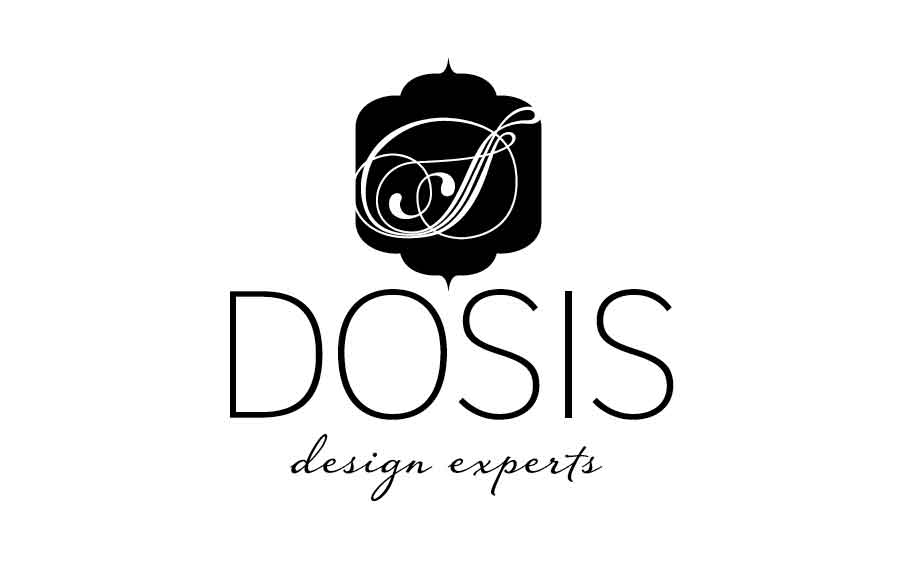
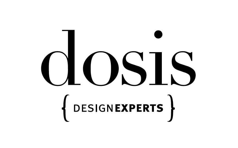
We did 4 rounds of designs, each presentation carrying between 3 to 5 alternatives. After a few back-and-forth, one logo design constantly survived since presentation #1, and was eventually selected as the right alternative.
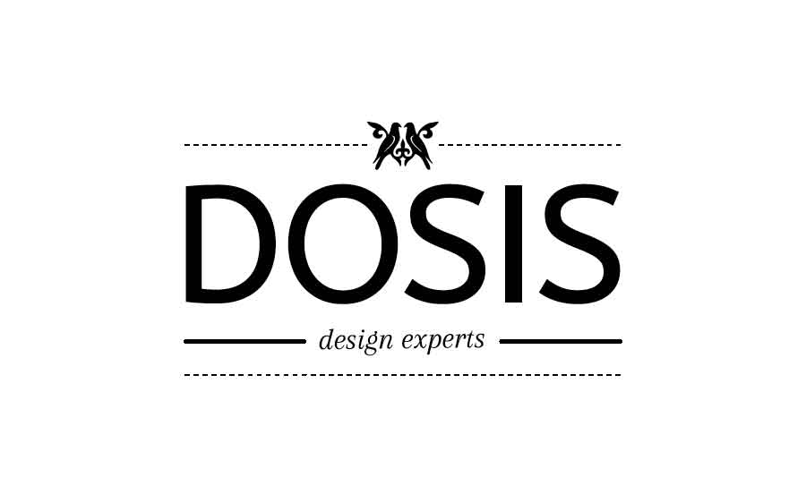
PRESENTATION 3
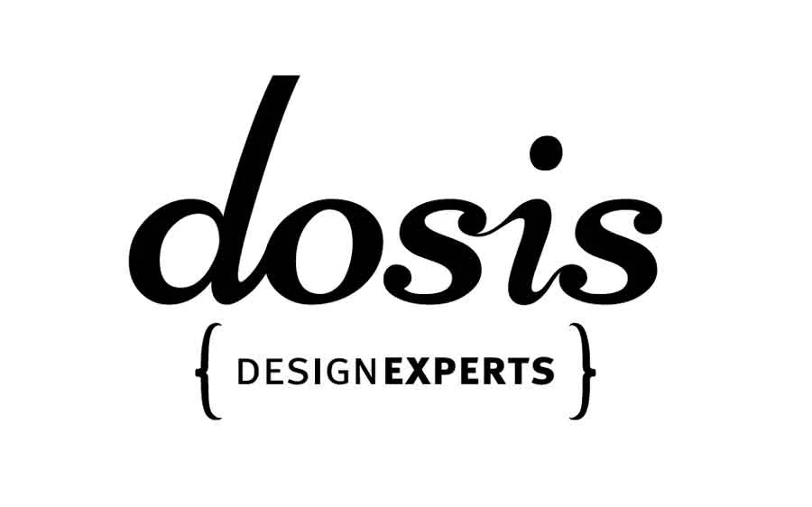
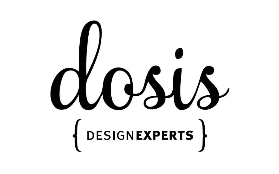
This was one of those situations, where the client loved a design since the first presentation, but was still curious to "see what else is up there". This was actually good for the design, because it allowed us to validate the logo against other alternatives and helped the client feel confident about their final decision.
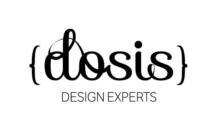
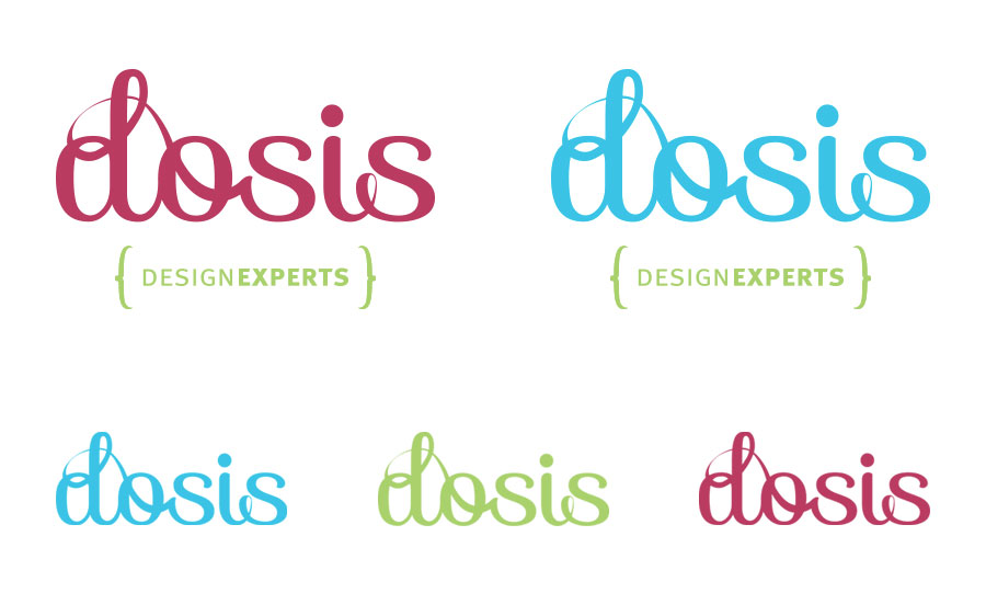
THE APPROVED DESIGN:

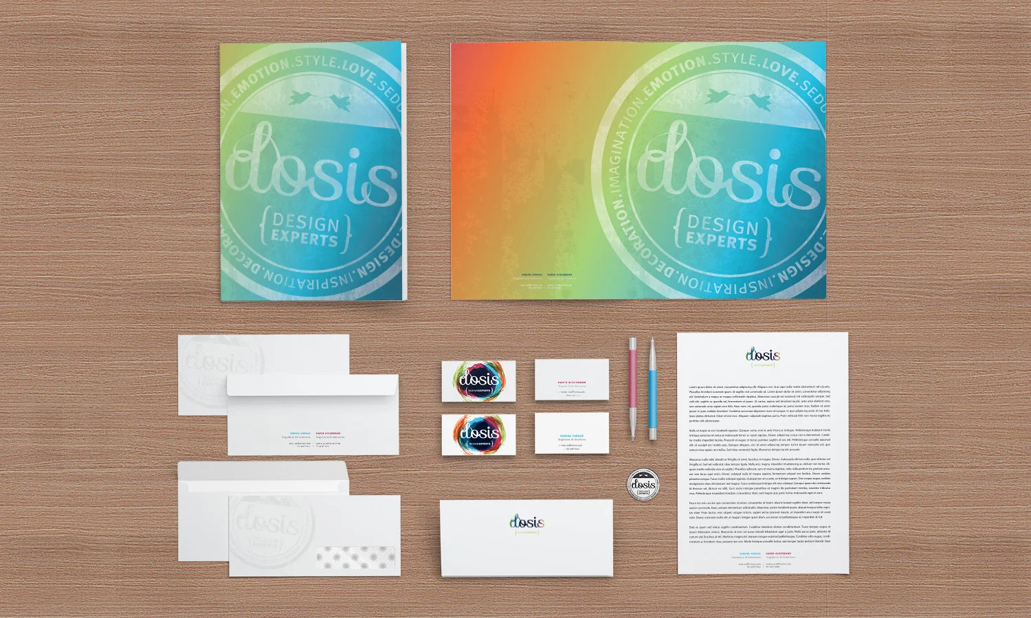
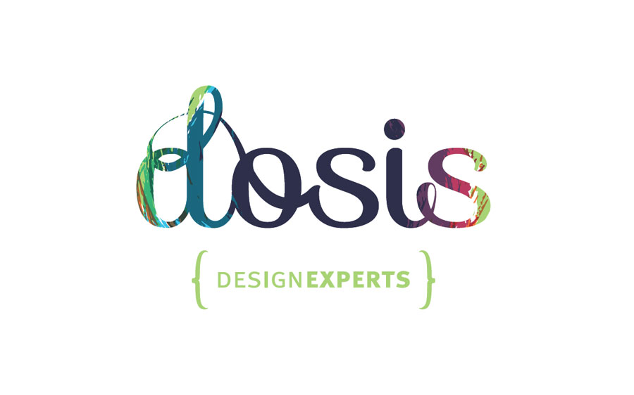
From here we started working on adding color, texture and creating different applications for a very flexible brand image:

And of course, the seal, which was then applied to the stationery and eventually used in their floor-plans a "quality seal":